Page 1
The first thing anyone will notice about your TCPmaker project are the attractive, fast-acting screen controls that your project will display on the PC browser.
This tutorial will show you all the screen controls that are currently available in TCPmaker Pro, and discuss their key properties and capabilities.
We'll show these in use in a typical layout you might make, and show which button on the palette you need to push in order to create one.
Click on the image for page view.
Page 2
Adding a control in TCPmaker is very easy:
1) Just click on a button on the Palette on the left side of the screen. (We've chosen a Horizontal Slider control.)
2) Next, click on the active drawing area (called the "Stage," and currently shown in blue) to actually place an instance of this control on the screen.
3) If a color picker shows up below the Stage area, click on one of the color swatches to set the color of your control.
4) Use the Item Properties page (use the scroll bar if necessary) to set the properties of the control.
Click on the image for page view.
Page 3
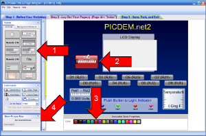
When you click on a control in your layout, you select it (shown by a white arrow on or above the control).
The Item Properties box shows the type of control you have selected, and the Property Page for this specific control. The red arrow points to the property page for this control.
We recommend that you enter a meaningful comment in the text box (just above the tab for this property page, also just above the red arrow). This comment will be shown in your generated code, to help make your project code self-documenting and easier to write and maintain.
Click on the image for page view.
Page 4
A Horizontal Slider control provides a convenient way for the user to quickly adjust and send a numeric value from the PC browser to the device, simply by dragging the black rectangular "slide rule slider" pointed to by the white arrow.
Horizontal Slider Properties:
cx - Color index (equivalent to the color selected with the color picker)
i - An Integer Variable that will transfer the state of the movable "thumb" of the slider: 0=not pressed, 1=pressed
n - A Numeric Variable that will transfer, to the web device, the current value as expressed by the Slider thumb position (see next page for details)
s - A String Variable that will show the current value in text form below the slider thumb. (Currently reads "2.353 Volts")
t - Text caption of this slider. (Currently reads "Volume")
Click on the image for page view.
Page 5
When you operate your project containing a Horizontal Slider control, your device will be connected to the Ethernet, and when your browser is pointed at the address of your device, the browser will show the layout that contains your Horizontal Slider control.
To use this control to adjust the Volume, you just drag the small black rectangular "slide rule slider" thumb to the left or right, just as you would any PC based slider control. When you do that, several things happen:
1) When you first start dragging the slider, you place the mouse cursor over the "thumb" and press the mouse button down. The Horizontal Slider control will send a "1" to your device, using the Integer variable whose Id you set in the i property of the slider (i4 in this case). Your device firmware may use that signal for some purpose.
2) As you move the "thumb" left or right, your Horizontal Slider control will send a stream of new values to your device, using the Numeric variable whose Id you set in the n property of the slider (n0 in this case). You probably will want to have your device firmware use that value for some purpose, like setting the "Volume" on your device.
3) If the String variable whose Id you set in the s property of the slider has a format string that refers to the same Numeric variable as property n, then the numeric value shown below the slider "thumb" will immediately change as well. (This happens automatically: you don't need to do anything.)
4) When you stop dragging the slider "thumb," you release the mouse button. The Horizontal Slider control will send a "0" to your device, using the Integer variable whose Id you set in the i property of the slider (i4 in this case).
Page 6
A String variable has a text property s that contains a string. This property could contain a simple string like "Volts," or it could contain a C-style format string like this:
"%5.3f Volts"
This string variable also has a property v that contains an argument list that is supposed to provide the Ids of the variables needed by the format statement. In this case, v would contain the following string:
"n0"
At the moment, the Numeric variable "Pot1" whose Id is "n0" has the following property values:
-
sample integer value i = 120
-
micro side min value mn = 0, micro side max value max mx = 255
-
PC side min value pn = 0, micro side max value max px = 5
On the PC, the Numeric variable automatically scales the value to 2.353, and the string variable Sv0 whose Id is "s0" uses the format string in its property s to display "2.353 Volts" on this particular Horizontal Slider control.
Page 7
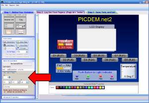
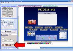
The red arrow is pointing at a red warning label at the bottom of the Property Page for the Horizontal Slider. Here is the meaning of this warning:
We showed on the previous slide that the string referred to in property s may have a format string and an argument list that refers to a variable.
The trouble is, there is no guarantee that the argument list in this string variable refers to the right variable (id="n0"), unless you make it so. If the argument list in "s0" refers to some other variable, the value displayed on the Horizontal Slider might not make any sense.
The red warning label just reminds that you check that you must make sure that these two variables, whose ids in the n and s properties, are consistent with each other.
Click on the image for page view.
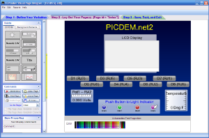
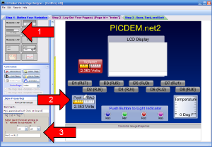
Page 8
A Horizontal Gauge control can display a numeric value sent from the micro to the PC.
Red arrow 1 shows which Palette button to click to create a Horizontal Gauge control (arrow 2) when you then click on the Stage.
Red arrow 3 shows the Property Page for the Horizontal Gauge.
Horizontal Gauge Properties:
n - A Numeric Variable that will transfer, to the web device, the current value as expressed by the gold bar position
s - A String Variable that will show the current value in text form below the gold bar. (Currently reads "2.353 Volts")
t - Text caption of this gauge. (Currently reads "Pot1 -- RA2")
Click on the image for page view.
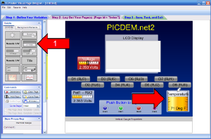
Page 9
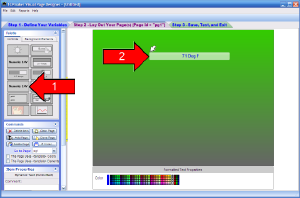
The Vertical Gauge Control is very similar to the Horizontal Gauge, but its orientation is vertical.
The Vertical Gauge has the following properties:
n - A Numeric Variable that will transfer, to the web device, the current value as expressed by the gold bar position
s - A String Variable that will show the current value in text form at the bottom of the gold bar. (Currently reads "71 Deg F")
t - Text caption of this gauge. (Currently reads "Temperature")
Click on the image for page view.
Page 10
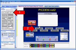
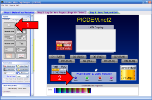
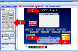
The rectangular Pushbutton control is a lighted button that is useful for sending an integer value (usually 0 or 1) to the micro device.
From the color pickers below the stage, or from the Property Page for this control type, you can select two colors for this button: a Passive Color, displayed initially and when the button is not being pushed, and an Active Color, displayed when the button is pushed or "down."
The Pushbutton control has 4 operating modes:
- Momentary - Button remains in the Active state only so long is it is being pushed
- Toggle - click once to make it toggle to Active state, where it will stay until clicked again.
- Radio - Button is one of a group of "radio buttons:" only one button in the group will toggle to the Active state at a time. (All other buttons in the group turn off.)
- Indicator - Clicking on the control does not change its state. Button only acts like a rectangular indicator light.
Click on the image for page view.
Page 11
The Pushbutton Control has the following properties:
c - Passive color index (0-15): index of color in Passive Color picker
a - Active color index (0-15): index of color in Active Color picker
st - State of the button: Idle or Active
i - Associated Integer Variable
m - Operating mode: momentary, toggle, radio, or indicator
rb - Radio button number (see next page). If m is not "radio" mode, set rb = 1.
t - Text caption to display on button face
g - HTML command to execute when button is Active. Could be used to go to another web site, or to jump to another page of your TCPmaker content: e.g. the string "<index/>" (without the quotes) would command run.swf to go to the first or "index" page of your multi-page TCPmaker content.
Page 12
Both the Pushbutton and the LED Indicator control classes have a Radio Button mode, that works like buttons on a car radio (and the similar kind of control group that is commonly used in Graphical User Interfaces in operating systems like Windows, MacOS, X-Windows, and many more).
In this mode, buttons are grouped together, and when a button in the group is clicked, that button goes "down" or to the "active" state, and all the other buttons must go "up" or to the "inactive" state.
Here's how to set up and use Radio Mode:
- In the Visual Page Designer, create a single Integer Variable to hold the number of the button that is currently active.
- Create a number of Pushbutton controls (or LED Indicator controls) that you want to become the Radio Group. Set the m (mode) property of each control in this group to Radio.
- For each control in the Radio Group, set the i property to the Id of the Integer Variable that you created in the first step above. This association of multiple controls operating in Radio Mode, each with the same Integer Variable, is what forms a specific Radio Group.
- Set the rb property of each Control in the group to a different value: 1, 2, 3, etc.
- A control in the Radio Group becomes "active" when the value of the Integer Variable matches the value of the rb property of that Control.
Example:
Create an Integer Variable. Let's say its name = ButtonNum and its id="iv0".
Create 3 Pushbutton controls, all having m = Radio, and all having i = "iv0".
Create 3 LED Indicator controls, all having i = "iv0".
Set rb = 1 for the first button in the group, rb = 2 for the second button, and rb = 3 for the third button.
Set rb = 1 for the first LED in the group, rb = 2 for the second LED, and rb = 3 for the third LED.
Resulting Behavior:
When you set the value of variable ButtonNum (id="iv0") to 2, the second Pushbutton changes to its Active state, and the second LED Indicator also changes to its Active state.
When you click on the first button, the value of ButtonNum is changed to 1 and sent to the micro device. The first Pushbutton and the first LED become Active, and the second Pushbutton and second LED become Passive or inactive.
Page 13
The LED Indicator is a colored light indicator that can be used either as an On / Off indicator, or as part of a Radio Group.
The LED Indicator has the following properties:
c - Passive color index (0-15): index of color in Passive Color picker
a - Active color index (0-15): index of color in Active Color picker
i - Associated Integer Variable
rb - Radio button number
Click on the image for page view.
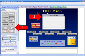
Page 14
The Input Text control can be used to send a text string that you type in the browser to your micro device. You type your text in the white line area at the bottom of the control. When ready to send the string, press <enter> on your keyboard, the PC will send the string to your device, and the string you just typed will be added to the logging area that is above the white input line. The logging area scrolls upward the way a terminal does, when it becomes filled.
The Input Text control can also display strings sent from your device. Received strings are added to logging area.
This is one of the "Communication Controls" that were mentioned in the previous tutorial, in that it sends or receives string data by referring to the Id of the control itself, rather than by referring to the Id of an associated Variable.
The Input Text control has the following properties:
t - Caption text at top of control, currently reading "LCD Display"
Click on the image for page view.
Page 15
The Text control was originally intended to hold static text for titles and captions. The various red arrows numbered "2" in the screen shot below show examples of this control at various point sizes.
This control can also receive strings sent from the micro device, so it can be used as an annunciator.
The Text control has the following properties:
c - Text color
p - Size in points
a - Alignment: left, center, right, or none
w - Width, only valid if Alignment property a = none.
t - Caption text being displayed
Click on the image for page view.
Page 16
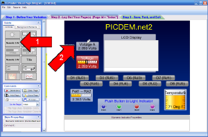
The Numeric Indicator control displays the value of a Numeric Variable in text form, under a static text caption, on a rectangular background.
This control has the following properties:
s - Associated String Variable. The value or values displayed are carried in the variables referenced in the argument list of the string variable, property v.
t - Text caption displayed at the top of the Numeric Indicator, currently "Voltage A"
Click on the image for page view.
Page 17
The Dynamic Text control is similar to the Numeric Indicator, in that it displays the formatted value of an associated String Variable on a rectangular background. However, the Dynamic Text control is wider than a Numeric Indicator, and has no built-in static caption text.
Dynamic Text has the following properties:
c - Color. (not a color index, but a full 24 bit color in Internet format 0xRRGGBB). Select from color picker below the stage, or color picker on Property Page.
s - String Variable that supplies the formatted text. Value(s) displayed are variables referenced in the argument list v of the String Variable.
Click on the image for page view.
Page 18
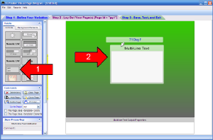
The Multi-Line Text control is an indicator that can display strings sent from the micro device, in a logging area that scrolls upward when filled, like a text terminal.
It is a Communication Control (like the Text and Input Text controls) in that it communicates string data by reference to the Multi-Line Text control itself, rather than referring to an associated Variable.
Multi-Line Text has the following properties:
t - Caption displayed across the top, currently reading "Multi-Line Text"
Click on the image for page view.
Page 19
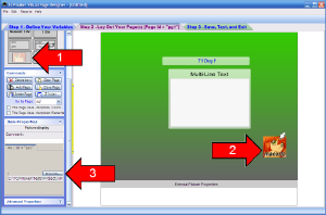
The Picture Display control, or "Pixie," can currently display a picture in one of two forms:
- A .JPG image, or
- A Flash .SWF file, which may be a static picture or even an animation.
You may be surprised to learn that, for the same image size, a .JPG (which uses file compression techniques to reduce the file size) will usually be far larger than a Flash SWF image. You may be far better off if you can use a .SWF file, even for a static image.
The fact that a SWF file can also contain an animation that can be as small as 1 KByte in size, makes this file format very attractive for embedded web developers.
Since storage size is very small on the type of microcontroller board that is typically used on an embedded web device, you should be careful to make sure that any image you embed into your embedded web device will fit within your device's storage capabilities.
TCPmaker's Picture Display Control has one single property:
f - File name of .jpg or .swf file. You should use the Browse button on the Property Page for this Control, not just because it is easier than having to type the file name, but also because this button will copy the image file to your project directory for testing, and make this file part of each of the build images you will create (for each compiler you chose).
Click on the image for page view.
|