
| TCPmaker : Visual Tour TCPmaker Screen Controls |
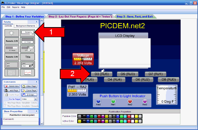
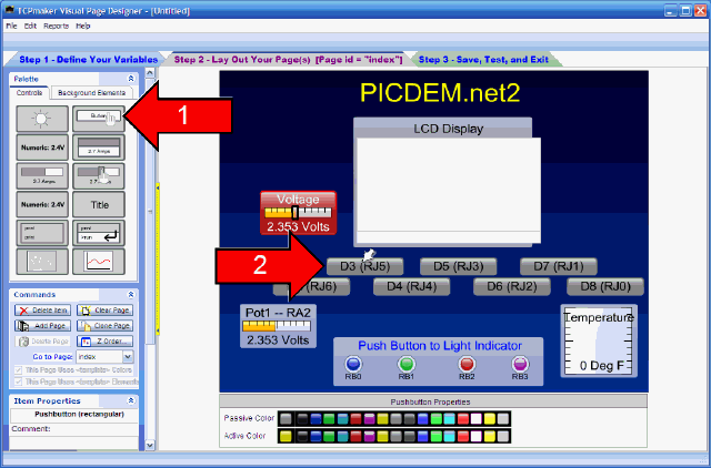
The rectangular Pushbutton control is a lighted button that is useful for sending an integer value (usually 0 or 1) to the micro device.
From the color pickers below the stage, or from the Property Page for this control type, you can select two colors for this button: a Passive Color, displayed initially and when the button is not being pushed, and an Active Color, displayed when the button is pushed or "down."
The Pushbutton control has 4 operating modes:
- Momentary - Button remains in the Active state only so long is it is being pushed
- Toggle - click once to make it toggle to Active state, where it will stay until clicked again.
- Radio - Button is one of a group of "radio buttons:" only one button in the group will toggle to the Active state at a time. (All other buttons in the group turn off.)
- Indicator - Clicking on the control does not change its state. Button only acts like a rectangular indicator light.
|
| 1 2 3 4 5 6 7 8 9 10 11 12 13 14 15 16 17 18 19 |
10 of 19